Review display
During a code review, reviewers spend most of their time using the review interface:
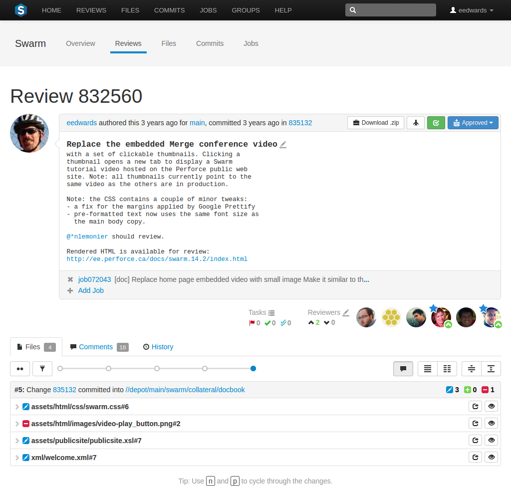
The review interface is very similar to the changelist interface; and provides largely the same functionality, but has several notable differences that are described in the following sections.
Test status


 When continuous
integration has been configured for a project, test success or
failure is indicated in the review's heading. If your continuous
integration tests can provide a URL that provides details of a test
run, the indicator becomes linked; click the indicator to see the test
details.
When you hover your mouse over the test status indicator, Swarm indicates the test status and how long ago that status was achieved.
Deployment status

 When automated
deployment has been configured for a project, the deployment
success or failure is indicated in the review's heading. If your
deployment program can provide a URL that provides details of the
deployment, the indicator becomes linked; click the indicator to see the
deployment results.
Review state
 The button is replaced with the
review state drop-down button that indicates the review's current
disposition. See States for more
information.
Edit description
![]() An icon appears in the review's
description, which allows you to update the description to reflect any
updates have been made during the review.
An icon appears in the review's
description, which allows you to update the description to reflect any
updates have been made during the review.
Tasks
 A Tasks area appears below the review's
description. This area summarizes the number of comments that have been
flagged as tasks, with separate counts for open, addressed, and verified
tasks. See Tasks for more details.
Click the
 button to display a dialog listing all tasks associated with the review:
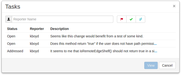
 Within the Tasks dialog, you can filter the tasks by
the reporter (the userid of the user who created the task), and/or by task
state; click:
-
The button to display only open tasks (comments that need to be addressed).
-
The button to display only addressed tasks (comments that have been addressed).
-
The button to display only verified tasks (comments that have been addressed and verified).
Note
Archived tasks do not appear in the Tasks dialog.
 To view a particular task, click once on a task within the
Tasks dialog to select it, and then click the
button. Or, double-click on a task. Either
way, the Tasks dialog closes and Swarm adjusts the
review display so that the chosen task is in view.
Reviewers
 A Reviewers area appears below the review's
description whenever a review has one or more reviewers, or you are
logged in.
This area includes, from left to right, the
edit reviewers
button
![]() , the current up and down vote counts, and the
avatars of current reviewers.
Required
reviewers have a star badge over their avatar. Whenever a
reviewer has voted on a review, their icon displays a badge indicating
whether they voted up or down. If you are logged in and viewing a review
you did not author, your avatar appears to the right of any other
reviewers and its appearance varies according to the following
conditions:
, the current up and down vote counts, and the
avatars of current reviewers.
Required
reviewers have a star badge over their avatar. Whenever a
reviewer has voted on a review, their icon displays a badge indicating
whether they voted up or down. If you are logged in and viewing a review
you did not author, your avatar appears to the right of any other
reviewers and its appearance varies according to the following
conditions:
|
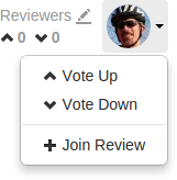
When you are not yet a reviewer, your avatar appears muted. Clicking your avatar presents a menu allowing you to vote up or down and thereby become a reviewer, or simply join a review as a reviewer.
|
When you are a reviewer, your avatar does not appear muted. If you have not yet voted, no badge appears on your avatar and clicking your avatar presents a menu allowing you to vote up or down, change whether your vote required or not, or leave the review.
|
|
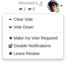
When you are a reviewer and have already voted, your avatar displays a badge indicating your vote. Clicking your avatar presents a menu allowing you to clear or change your vote, change whether your vote is required or not, or leave the review.
|
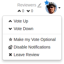
When you are a required reviewer, your avatar displays a star badge indicating that the review cannot be approved until you vote up. Clicking your avatar presents a menu allowing you to change your vote, make your vote optional, or leave the review.
|
 When a review is updated, if the review's list of files, file content,
or file-types changes, any votes cast on the review become
stale. The vote counts are reset, and the vote
indicators become muted.
 If you hover your mouse over a reviewer with a stale vote, a tooltip
appears displaying the userid, how they voted, and on which version of
the review; each version is represented as a point on the Review
Timeline (see below).
Note
Stale vote handling is not supported for Git-created reviews.
Disable notifications
When you become a review participant, by joining the review or being @mentioned in a comment or in the review's description, you receive notifications for any events associated with the review. If you find that the notifications become more of a burden than benefit and you wish to continue being a review participant, you can disable notifications:
-
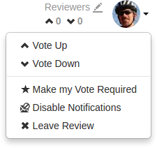 Click your avatar in the reviewers area to display your reviewer options.
-
Click Disable Notifications.
Once notifications are disabled, you no longer receive notifications. However, if you are @mentioned in a subsequent review comment, you do receive a notification for that comment; regular notifications remain disabled. This approach ensures that you don't miss anything that other reviewers or the review author deems important.
Changing the review author
If the configuration option to allow users to change the author of a review is enabled, then an extra icon is displayed to the left of the Tasks and Reviewers icons. By default this option is disabled, so talk to your Swarm Administrator if you require this feature.

If the author icon is displayed, then clicking the edit icon will open a dialog that allows the author of this review to be changed. This is useful if the original author is no longer available, or ownership has passed to a different developer.
Review timeline
A slider control, called the Review Timeline, appears just above the list of files. If the review's files have been updated at least once, this slider allows you to browse and compare arbitrary versions of the review's files by dragging the version point(s) on the slider.

 Each point on the slider represents a version of the review's files,
with the oldest version on the left and newer versions on the right.
Hover your mouse over each point to see a tooltip displaying the version
number, who created it and when, plus the changelist containing a copy
of that version's files.
If you adjust the slider while files within the review are expanded, Swarm keeps those same files expanded whenever new versions need to be displayed.
The button to the left of the slider with two dots toggles diff mode for arbitrary versions of the review's files. In diff mode, the slider shows a bar indicating which two versions are being compared, and the endpoints of the slider can be dragged to any of the available points to compare any earlier version of the review with any later version.

Hovering your mouse over the bar shows a tooltip displaying the versions being compared, and the changelists that contain the files.

When a reviews has many, many versions, Swarm maintains a minimum distance between version dots, which then requires horizontal scrolling.

Dragging one of the version points to the edge of the timeline display
area causes the timeline to scroll in the direction of the drag motion,
until the end of the timeline is reached. Alternately, click either the
 or
or
 buttons, or drag the scrollbar itself, to adjust the scroll position.
When you release the version point, Swarm adjusts the scroll amount to place the version dots within view, when possible.
Note
It is good to remember that a review consists of one or more Swarm-managed changelists. When comparing versions of a review, Swarm is showing any differences between the selected versions, not the review author's personal changelist. See Internal representation for details.
 For involved reviews that have many revisions and many comments, it can
sometimes be difficult to determine whether the points expressed in
comments have been addressed. To help with such situations, click the
to limit the displayed comments to
the current review version.
File listing
The file listing header displays:

-
The current version of the files in the review.
-
Which changelist contains a shelved copy of the review's files.
-
The common path for all of the files in the review.
In diff mode, the file listing header displays:

-
Which two versions of the review's files are being compared.
-
Which changelists contain the files being compared.
-
The common path for all of the files in both versions of the review.
History tab
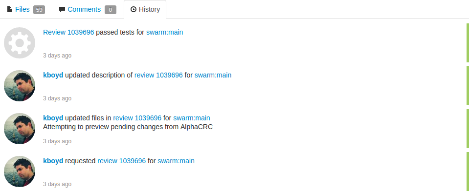
The History tab presents a list of the events that affect this review, including:
-
When the review was started
-
When a new reviewer joins the review
-
When the review's state changes
-
When the review's files are updated
-
When a reviewer votes on the review
-
When someone comments on the review, or one of its files
-
When tests pass or fail, provided continuous integration is configured
Mark as read
 Beside each file in a review is a
button, which help you keep track of which files you have
reviewed. The read flag is remembered independently for each user. If
the content of a file is changed in an update to the review, the read
flag automatically clears. This is particularly useful when a code
review consists of many files.
When clicked, the button's colors invert and the associated file is visually muted, to make it easy to distinguish read files from unread files:

If a file has been marked as read, click the button a second time to reset the status to unread.
Identifying reviews created with Git Fusion
 Git Fusion-initiated reviews include the Git logo beside the main review
identifier. This indicator is important because Perforce users cannot
update Git Fusion-initiated reviews.
